![]()

Time Series By Regions (with Conversion to Pandas and Visualization with Seaborn)
Tutorial created by **David Montero Loaiza**: GitHub | Twitter
GitHub Repo: https://github.com/davemlz/eemont
PyPI link: https://pypi.org/project/eemont/
Conda-forge: https://anaconda.org/conda-forge/eemont
Documentation: https://eemont.readthedocs.io/
More tutorials: https://github.com/davemlz/eemont/tree/master/docs/tutorials
Let’s start!
If required, please uncomment:
[1]:
#!pip install eemont
#!pip install geemap
Import the required packages.
[2]:
import ee, eemont, geemap
import pandas as pd
import numpy as np
import seaborn as sns
from matplotlib import pyplot as plt
Authenticate and Initialize Earth Engine and geemap.
[3]:
Map = geemap.Map()
Let’s use some center-pivot crops in Egypt:
[4]:
pivots = ee.FeatureCollection([
    ee.Feature(ee.Geometry.Point([27.724856,26.485040]).buffer(400),{'pivot':0}),
    ee.Feature(ee.Geometry.Point([27.719427,26.478505]).buffer(400),{'pivot':1}),
    ee.Feature(ee.Geometry.Point([27.714185,26.471802]).buffer(400),{'pivot':2})
])
Let’s pre-process and process our image collection:
[5]:
L8 = (ee.ImageCollection('LANDSAT/LC08/C01/T1_SR')
      .filterBounds(pivots)
      .maskClouds()
      .scaleAndOffset()
      .spectralIndices(['EVI','GNDVI']))
Time Series By Regions
Let’s get the L8 time series for our buffer. Checklist:
Image Collection: The Landsat 8 collection.
Bands to use for the time series: GNDVI and EVI.
Feature Collection: Our center-pivot crops.
Statistics to compute: Mean and Median.
Scale: 30 m.
[6]:
ts = L8.getTimeSeriesByRegions(collection = pivots,
                               bands = ['EVI','GNDVI'],
                               reducer = [ee.Reducer.mean(),ee.Reducer.median()],
                               scale = 30)
Conversion to Pandas
The time series is retrieved as a feature collection. To convert it to a pandas dataframe we’ll use geemap (This may take a little bit):
[7]:
tsPandas = geemap.ee_to_pandas(ts)
Let’s check our pandas data frame:
[8]:
tsPandas
[8]:
| date | pivot | EVI | reducer | GNDVI | |
|---|---|---|---|---|---|
| 0 | 2013-04-01T08:40:36 | 0 | 0.585979 | mean | 0.648333 |
| 1 | 2013-04-01T08:40:36 | 1 | 0.131134 | mean | 0.312830 |
| 2 | 2013-04-01T08:40:36 | 2 | 0.642244 | mean | 0.697033 |
| 3 | 2013-04-11T08:40:46 | 0 | 0.290635 | mean | 0.482938 |
| 4 | 2013-04-11T08:40:46 | 1 | 0.099826 | mean | 0.297480 |
| ... | ... | ... | ... | ... | ... |
| 1141 | 2021-09-08T08:37:40 | 1 | 0.327657 | median | 0.507243 |
| 1142 | 2021-09-08T08:37:40 | 2 | 0.289696 | median | 0.451613 |
| 1143 | 2021-10-10T08:37:49 | 0 | 0.154731 | median | 0.366600 |
| 1144 | 2021-10-10T08:37:49 | 1 | 0.446784 | median | 0.630140 |
| 1145 | 2021-10-10T08:37:49 | 2 | 0.199530 | median | 0.403407 |
1146 rows × 5 columns
What can we see here?
The values for each band (GNDVI and EVI) are in separated columns.
There are some -9999 values in the GNDVI and EVI columns. These values represent the NA values (e.g. Clouds or shadows). The -9999 can be changed by modifying the
naValueparameter in thegetTimeSeriesByRegionmethod (e.g.naValue = -10000).Multiple reducers can be used. In the output dataframe they are specified by a single column named
reducer: mean, median.The date is a string that needs to be converted to a date data type.
The attributes of the original feature collection are attached to the data frame:
pivot.
Given this, let’s curate our data frame!
First, let’s get rid of the -9999 value:
[9]:
tsPandas[tsPandas == -9999] = np.nan
And now, let’s convert the date to a date data type:
[10]:
tsPandas['date'] = pd.to_datetime(tsPandas['date'],infer_datetime_format = True)
We can also gather the GNDVI and EVI columns into a single column to make the data frame more ‘tidy-er’ (This is optional):
[11]:
tsPandas = pd.melt(tsPandas,
                   id_vars = ['reducer','date','pivot'],
                   value_vars = ['GNDVI','EVI'],
                   var_name = 'Index',
                   value_name = 'Value')
Let’s check our curated data frame:
[12]:
tsPandas
[12]:
| reducer | date | pivot | Index | Value | |
|---|---|---|---|---|---|
| 0 | mean | 2013-04-01 08:40:36 | 0 | GNDVI | 0.648333 |
| 1 | mean | 2013-04-01 08:40:36 | 1 | GNDVI | 0.312830 |
| 2 | mean | 2013-04-01 08:40:36 | 2 | GNDVI | 0.697033 |
| 3 | mean | 2013-04-11 08:40:46 | 0 | GNDVI | 0.482938 |
| 4 | mean | 2013-04-11 08:40:46 | 1 | GNDVI | 0.297480 |
| ... | ... | ... | ... | ... | ... |
| 2287 | median | 2021-09-08 08:37:40 | 1 | EVI | 0.327657 |
| 2288 | median | 2021-09-08 08:37:40 | 2 | EVI | 0.289696 |
| 2289 | median | 2021-10-10 08:37:49 | 0 | EVI | 0.154731 |
| 2290 | median | 2021-10-10 08:37:49 | 1 | EVI | 0.446784 |
| 2291 | median | 2021-10-10 08:37:49 | 2 | EVI | 0.199530 |
2292 rows × 5 columns
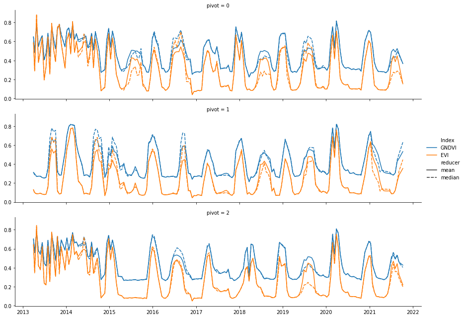
Visualization
Now, let’s visualize our time series using seaborn:
[13]:
g = sns.FacetGrid(tsPandas,row = 'pivot',height = 3,aspect = 4)
g.map_dataframe(sns.lineplot,x = 'date',y = 'Value',hue = 'Index',style = 'reducer')
g.add_legend()
[13]:
<seaborn.axisgrid.FacetGrid at 0x7f8cb5dd34f0>