![]()

Time Series By Region (with Conversion to Pandas and Visualization with Seaborn)
Tutorial created by **David Montero Loaiza**: GitHub | Twitter
GitHub Repo: https://github.com/davemlz/eemont
PyPI link: https://pypi.org/project/eemont/
Conda-forge: https://anaconda.org/conda-forge/eemont
Documentation: https://eemont.readthedocs.io/
More tutorials: https://github.com/davemlz/eemont/tree/master/docs/tutorials
Let’s start!
If required, please uncomment:
[1]:
#!pip install eemont
#!pip install geemap
Import the required packages.
[2]:
import ee, eemont, geemap
import pandas as pd
import numpy as np
import seaborn as sns
from matplotlib import pyplot as plt
Authenticate and Initialize Earth Engine and geemap.
[3]:
Map = geemap.Map()
Let’s use a buffered point for the time series!
[4]:
point = ee.Geometry.Point([11.178576,51.122064]).buffer(100)
Let’s pre-process and process our image collection:
[5]:
L8 = (ee.ImageCollection('LANDSAT/LC08/C01/T1_SR')
      .filterBounds(point)
      .maskClouds()
      .scaleAndOffset()
      .spectralIndices(['GNDVI','EVI']))
Time Series By Region
Let’s get the L8 time series for our buffer. Checklist:
Image Collection: The Landsat 8 collection.
Bands to use for the time series: GNDVI and EVI.
Geometry: Our buffered point.
Statistics to compute: Minimum, Mean, and Maximum.
Scale: 30 m.
[6]:
ts = L8.getTimeSeriesByRegion(geometry = point,
                              bands = ['EVI','GNDVI'],
                              reducer = [ee.Reducer.min(),ee.Reducer.mean(),ee.Reducer.max()],
                              scale = 30)
Conversion to Pandas
The time series is retrieved as a feature collection. To convert it to a pandas dataframe we’ll use geemap (This may take a little bit):
[7]:
tsPandas = geemap.ee_to_pandas(ts)
Let’s check our pandas data frame:
[8]:
tsPandas
[8]:
| EVI | GNDVI | reducer | date | |
|---|---|---|---|---|
| 0 | -9999.000000 | -9999.000000 | min | 2013-04-20T10:04:44 |
| 1 | -9999.000000 | -9999.000000 | min | 2013-06-07T10:04:59 |
| 2 | 0.556182 | 0.653012 | min | 2013-07-09T10:04:56 |
| 3 | 0.624375 | 0.610642 | min | 2013-07-25T10:04:55 |
| 4 | 0.652409 | 0.768563 | min | 2013-08-10T10:04:57 |
| ... | ... | ... | ... | ... |
| 739 | -9999.000000 | -9999.000000 | max | 2021-07-22T10:09:06 |
| 740 | -9999.000000 | -9999.000000 | max | 2021-08-07T10:09:14 |
| 741 | -9999.000000 | -9999.000000 | max | 2021-08-23T10:09:18 |
| 742 | 0.648737 | 0.834015 | max | 2021-09-08T10:09:23 |
| 743 | 0.475067 | 0.802076 | max | 2021-10-10T10:09:32 |
744 rows × 4 columns
What can we see here?
The values for each band (GNDVI and EVI) are in separated columns.
There are some -9999 values in the GNDVI and EVI columns. These values represent the NA values (e.g. Clouds or shadows). The -9999 can be changed by modifying the
naValueparameter in thegetTimeSeriesByRegionmethod (e.g.naValue = -10000).Multiple reducers can be used. In the output dataframe they are specified by a single column named
reducer: min, mean, max.The date is a string that needs to be converted to a date data type.
Given this, let’s curate our data frame!
First, let’s get rid of the -9999 value:
[9]:
tsPandas[tsPandas == -9999] = np.nan
And now, let’s convert the date to a date data type:
[10]:
tsPandas['date'] = pd.to_datetime(tsPandas['date'],infer_datetime_format = True)
We can also gather the GNDVI and EVI columns into a single column to make the data frame more ‘tidy-er’ (This is optional):
[11]:
tsPandas = pd.melt(tsPandas,
                   id_vars = ['reducer','date'],
                   value_vars = ['GNDVI','EVI'],
                   var_name = 'Index',
                   value_name = 'Value')
Let’s check our curated data frame:
[12]:
tsPandas
[12]:
| reducer | date | Index | Value | |
|---|---|---|---|---|
| 0 | min | 2013-04-20 10:04:44 | GNDVI | NaN |
| 1 | min | 2013-06-07 10:04:59 | GNDVI | NaN |
| 2 | min | 2013-07-09 10:04:56 | GNDVI | 0.653012 |
| 3 | min | 2013-07-25 10:04:55 | GNDVI | 0.610642 |
| 4 | min | 2013-08-10 10:04:57 | GNDVI | 0.768563 |
| ... | ... | ... | ... | ... |
| 1483 | max | 2021-07-22 10:09:06 | EVI | NaN |
| 1484 | max | 2021-08-07 10:09:14 | EVI | NaN |
| 1485 | max | 2021-08-23 10:09:18 | EVI | NaN |
| 1486 | max | 2021-09-08 10:09:23 | EVI | 0.648737 |
| 1487 | max | 2021-10-10 10:09:32 | EVI | 0.475067 |
1488 rows × 4 columns
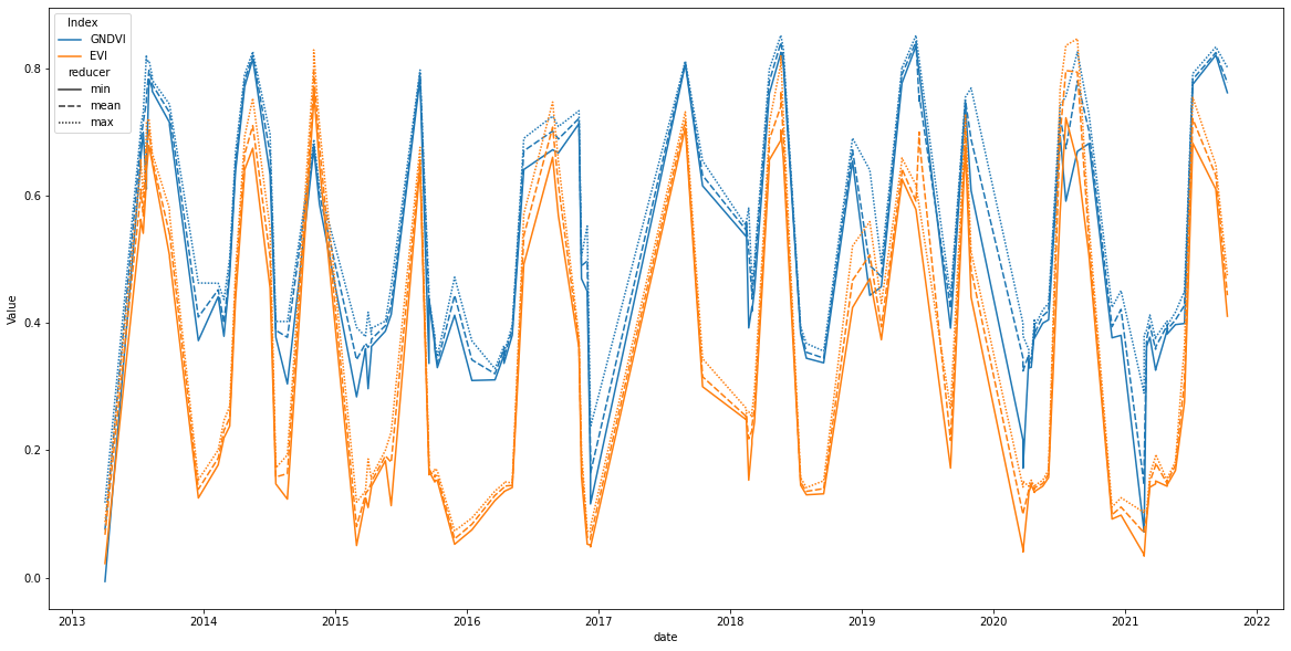
Visualization
Now, let’s visualize our time series using seaborn:
[13]:
plt.figure(figsize = (20,10))
sns.lineplot(data = tsPandas,
             x = 'date',
             y = 'Value',
             hue = 'Index',
             style = 'reducer')
[13]:
<AxesSubplot:xlabel='date', ylabel='Value'>